
Professional Responsive Web Design: A Brief Overview
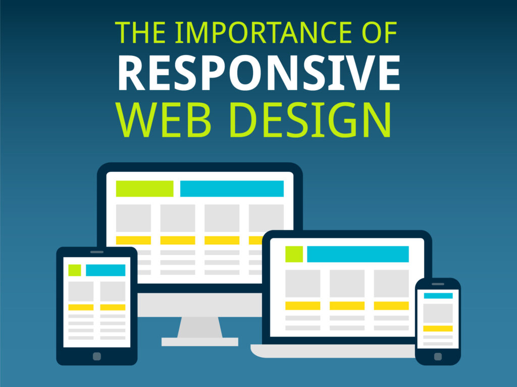
When I think about responsive web design, I see it as more than just a technique—it’s an art. It’s about crafting websites that seamlessly adapt to any screen, whether it’s a sprawling desktop monitor, a compact tablet, or a pocket-sized smartphone. At its heart, responsive design ensures a site looks stunning and functions flawlessly, no matter where or how it’s viewed.
To make this possible, I rely on a few essential tools: flexible layouts, fluid images, and CSS media queries. These elements work together to dynamically adjust a site’s structure based on screen size, orientation, and resolution, creating a smooth and intuitive UI/UX Experience.
Breaking it down further, three key principles shape effective responsive design. First, fluid grids act as the backbone, replacing rigid pixel-based layouts with percentage-based units that scale proportionally across devices. Second, flexible images adjust within their containers, preventing distortion or awkward cropping. Lastly, CSS media queries serve as the magic ingredient, enabling style adjustments tailored to different screens.
Why does this matter so much? Simple—the mobile revolution. With more people browsing on their phones than ever before, a poorly optimized site can frustrate users and drive them away. Responsive web design isn’t just about looking good—it’s about enhancing performance, improving user engagement, and delivering an experience that feels natural across all platforms.
The Evolution of Web Design: Why Responsive Became Standard
At Vortexian Tech, we’ve witnessed web design evolve from rigid, static layouts to the dynamic, responsive experiences we see today. In the early days, websites were built primarily for desktops, relying on fixed-width designs that didn’t adjust to different screen sizes. This wasn’t just inconvenient—it created accessibility challenges and limited the user experience. But as smartphones and tablets skyrocketed in popularity, it became clear that this old approach simply wouldn’t cut it anymore.
Responsive design didn’t just make web browsing easier—it transformed UI/UX experience. By leveraging fluid grids, flexible images, and media queries, we could create layouts that Professionally adjusted to any screen size and orientation. No more endless pinching and zooming just to read content. Businesses quickly noticed the impact, too—Google prioritized mobile-friendly sites, giving responsive designs an edge in search rankings(SERP).
This shift wasn’t just a passing trend; it became an absolute necessity. At Vortexian Tech, we believe responsiveness is more than just a design principle—it’s the foundation of a more inclusive, accessible internet. In a world where users expect seamless experiences across all devices, responsive design isn’t just about aesthetics. It’s about delivering performance, flexibility, and usability in an ever-evolving digital landscape.
Key Features of Responsive Web Design in 2025
When I look at the landscape of responsive web design in 2025, it’s clear that the evolution of technology continues to shape its core principles. Here are the key features that I identify as critical for success in crafting websites that adapt seamlessly to devices and user expectations:
1. Adaptive Layouts with Advanced Flexibility
I’ve seen layouts become smarter and more adaptable. Websites now use CSS Grid, Flexbox, and advanced fluid typography to ensure interfaces adjust precisely, regardless of screen size or orientation. These layouts prioritize maintaining usability across foldables, wearables, ultra-wide monitors, and everything in between.
2. Device-Specific Interaction Optimization
I notice that touch-friendly interfaces aren’t just an option; they’re a necessity. Features like larger touch targets, visible focus indicators, and haptic feedback are integrated to enhance usability for both touchscreens and traditional devices.
3. Accessibility Integration
Responsive web design in 2025 goes hand-in-hand with accessibility. I focus on ARIA (Accessible Rich Internet Applications) standards and dynamic scaling for visual impairments. It’s not just about resizing—it’s about creating websites that adapt functionally for all users.
4. Faster Loading Through Lightweight Design
Speed dominates user expectations. I’ve observed how designers are leveraging lazy loading, responsive images, and compressed assets to ensure faster load times while balancing visual quality on high-resolution and low-powered devices alike.
5. AI-Driven Personalization
I am excited about the seamless integration of AI. Features like device-aware responsive menus and personalized content delivery now adapt layouts in real time based on individual user behavior and preferences.
6. Prioritization of Performance Metrics
I rely on tools like Core Web Vitals to continuously measure load times, interactivity, and visual stability. Meeting these metrics within responsive designs is critical for great user experiences and SEO performance.
Responsive web design in 2025 ensures that every design decision supports an increasingly diverse user base, no matter what device or environment they are in.

Mobile-First Indexing: Driving the Need for Responsiveness
When I first learned about mobile-first indexing, it completely changed how I viewed web design. As you may know, Google has officially prioritized mobile versions of websites for indexing and ranking. This shift wasn’t arbitrary—it reflects how the majority of internet users now browse the web. According to recent studies, over 60% of web traffic comes from mobile devices. If a website isn’t optimized for mobile use, it risks being penalized in search rankings. This fundamentally drives the vital need for responsive web design.
The beauty of responsive design lies in its adaptability. I’ve noticed that a well-designed responsive website ensures a seamless experience across devices, whether someone is accessing it on a smartphone, tablet, or desktop. For mobile-first indexing to work in your favor, having a single URL and codebase that shifts depending on screen size and resolution is imperative. Google’s algorithm rewards this kind of user-centric structure because it simplifies crawling and indexing, reduces load time, and minimizes duplicate content.
A non-responsive site, on the other hand, can struggle in several key areas. Poor navigation on smaller screens frustrates users and increases bounce rates. Plus, when button spacing or font sizes aren’t optimized for touch functionality, it leads to accessibility issues. I’ve observed these missteps harm both user engagement and rankings.
With mobile-first indexing steering SEO strategy, it’s critical to ensure responsiveness isn’t just an afterthought but a core part of design planning. By prioritizing mobile users, I believe we’re aligning our efforts not just with Google’s guidelines but with how people naturally engage online today.
Improved User Experience: How Responsive Design Boosts Engagement
When I explore a website that seamlessly adjusts to my device, whether it’s a smartphone, tablet, or desktop, I immediately notice the difference. Responsive web design is what makes this possible, and its impact on user experience is undeniable. A website that adapts fluidly ensures that no matter how I access it, navigation feels intuitive and visually appealing, which naturally keeps me more engaged.
One of the primary ways responsive design enhances user experience is by eliminating the frustration of pinching, zooming, and scrolling sideways. When a site is designed to respond to my screen size, I can interact with content effortlessly, whether I’m reading an article, clicking links, or filling out forms. This usability encourages me to stay longer, explore further, and return in the future.
- Faster Loading Times: A responsive design often prioritizes efficiency. It optimizes images, layouts, and elements so pages load quickly on any device. This ensures I don’t lose patience while waiting, especially when using mobile networks.
- Consistent Experience: Visiting a site on different devices should feel cohesive. I appreciate designs that present uniform branding and functionalities, whether I’m on my laptop at work or browsing on my phone during my commute.
- Accessibility Improvements: I’ve noticed that responsive websites often cater better to individuals with disabilities. Proper scaling, readable fonts, and touchscreen-friendly navigation improve accessibility for everyone.
From my perspective, responsive design transforms how I relate to a brand online. It simplifies interactions, reduces barriers, and creates a seamless connection across platforms. As someone who values convenience and efficiency, I’m more likely to recommend, interact with, and trust websites that prioritize a robust and flexible user experience.
SEO Advantages: Why Google Prioritizes Responsive Websites
When I look at how Google determines rankings, the importance of responsive web design stands out. Google wants users to have a seamless experience, regardless of the device they’re using. Responsive websites inherently align with this goal, offering adaptability to adjust layouts, images, and functionality to fit various screen sizes. This flexibility directly impacts critical search engine ranking factors.
First, I understand that page loading speed is a key component. Responsive designs typically lead to faster loading times on both desktops and mobile devices because they eliminate the need for separate mobile URLs or duplicate content. Since Google rewards websites that load quickly, a responsive design gives me a clear advantage in search rankings.
Second, mobile usability plays a significant role in search engine algorithms. Google uses mobile-first indexing, which means it primarily evaluates the mobile version of a website when determining its rankings. If a website isn’t mobile-friendly, I know it’s less likely to rank well, no matter how robust its content or other SEO efforts may be.
Another advantage I notice with responsive design lies in reducing bounce rates. Users often leave a website if it doesn’t render properly on their device. A poorly optimized site frustrates visitors, and Google interprets a high bounce rate as a sign of low-quality content. By adopting responsive design, I can ensure my site is user-friendly, keeping visitors engaged and signaling to Google that my content is valuable.
Additionally, having a single responsive site simplifies SEO management. Instead of optimizing separate desktop and mobile versions, I only need to focus my SEO efforts on one URL. This prevents issues like duplicate content cannibalizing rankings and streamlines link-building strategies.
E-Commerce Success: Adapting to Consumer Device Trends
When I think about how consumers interact with e-commerce platforms in 2025, one thing is immediately clear: their preferences are driven by the devices they use. Smartphones, tablets, laptops, smartwatches, and even connected TVs play a central role in shaping shopping behaviors. The ability to seamlessly deliver a shopping experience across these devices isn’t optional; it’s essential.
Mobile commerce is dominating the landscape. I’ve noticed that consumers increasingly rely on smartphones, not just for purchasing but also for browsing, price comparisons, and reading reviews. A design that doesn’t adapt fluidly to smaller screens risks losing engagement immediately. Pages that load slowly, have illegible text sizes, or require excessive scrolling deter users. In my experience, a poor mobile experience means a customer is one tap away from switching to a competitor.
On the other hand, laptops and desktops still hold importance for more detailed purchases, especially for higher-ticket items or when multiple tabs are needed to compare products. If I’m navigating between devices—and most consumers do—I expect my cart to sync effortlessly across platforms, ensuring continuity is maintained.
E-commerce success in 2025 demands considering how individuals interact with their devices throughout the day. Each touchpoint needs to feel intuitive, consistent, and human-centered. Any misstep in aligning with these trends risks eroding trust and loyalty.
Cost and Time Efficiency: Simplifying Maintenance with Responsiveness
If I need to make a design change, I only do it once. Whether it’s updating imagery, adjusting content, or enhancing functionality, these updates propagate seamlessly across all device types. Compared to juggling the maintenance of multiple layouts, responsive design streamlines my workflow and frees up valuable resources. It’s like having a centralized hub where every adjustment has an immediate, universal impact.
Additionally, search engines favor streamlined, responsive designs. Instead of splitting traffic or SEO efforts across multiple URLs, a unified site structure strengthens my rankings and lowers the cost required for search engine optimization.
Through responsiveness, I find that I save not only time and money but also avoid the frustration of managing fragmented systems. It’s an efficient, future-proof approach that keeps my workflow simple and my stress levels low.
Future Trends: How Responsive Web Design is Shaping 2025
One trend I notice is the rise of AI-powered responsive frameworks.
1. Adapting to a Multi-Device Digital Landscape
With an ever-growing range of internet-enabled devices—from smartphones and tablets to smartwatches and desktop monitors—ensuring an optimal viewing experience is essential. Responsive web design guarantees that your website adjusts seamlessly to various screen sizes, delivering a consistent and engaging user experience.
2. Enhancing User Experience (UX) for Maximum Engagement
User expectations continue to rise, demanding fast-loading pages, intuitive navigation, and visually appealing layouts. A responsive design ensures effortless readability and smooth interactions, reducing bounce rates and keeping visitors engaged with your content.
3. Strengthening SEO and Search Engine Rankings
Google prioritizes mobile-friendly websites, making responsiveness a crucial factor for SEO. With mobile traffic surpassing desktop usage, ensuring your site adapts to different devices helps maintain high search visibility and improves rankings in search engine results.
4. Future-Proofing Your Website for Emerging Technologies
New devices and screen sizes constantly enter the market. A responsive design approach ensures your website remains flexible and adaptable, preventing the need for frequent redesigns and saving both time and resources.
5. Promoting Accessibility and Inclusive Web Experiences
Web accessibility is a key focus in 2025, and responsive design plays a significant role in ensuring users of all abilities can interact with your site. A well-structured, mobile-friendly layout improves usability and broadens your audience reach while aligning with ethical and legal standards.
6. Increasing Conversions Through Seamless Interactions
A frictionless browsing experience fosters trust, encourages user engagement, and leads to higher conversion rates. Whether you aim to generate leads, sell products, or promote services, a responsive design eliminates obstacles that could deter users from taking action.
7. Gaining a Competitive Edge in the Digital Space
A responsive website differentiates you from competitors who neglect mobile optimization. Prioritizing user experience and modern design standards positions your business as a leader in your industry, attracting and retaining more customers.
How to Implement Responsive Web Design
To achieve a responsive website, consider these key strategies:
- Flexible Grid Systems: Utilize percentage-based layouts instead of fixed dimensions.
- Adaptive Images: Ensure images resize and scale appropriately across devices.
- CSS Media Queries: Apply styles based on screen width and resolution.
- Mobile-First Approach: Design for smaller screens first, then scale up for larger ones.
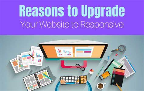
Steps to Upgrade Your Website to a Responsive Design
When transitioning a website to responsive design, I’ve learned that it’s vital to approach the process systematically. Following a clear pathway ensures a smoother migration and an enhanced end-user experience. Here’s how I would tackle it:
- Evaluate Your Current Website I begin by assessing the existing site structure. I review analytics to identify high-traffic pages and devices most commonly used by visitors. This helps prioritize which pages and elements need immediate attention.
- Understand Your Target Audience It’s essential to know your audience. I research their browsing behaviors, preferred devices, and how they interact with the site. This data informs decisions about layout, functionality, and usability.
- Audit the Existing Content Next, I evaluate the site’s current content. Responsive design often benefits from concise, structured content. I consider removing outdated information or breaking up long paragraphs for better readability on smaller screens.
- Choose a Flexible Framework or CMS I then select a content management system (CMS) or framework that supports responsive design. Bootstrap, for example, offers flexibility, but I also ensure the chosen platform aligns with specific project goals.
- Implement Responsive Design Principles Using fluid grids and flexible images, I adjust the layout to adapt seamlessly to various screen sizes. I focus on maintaining a natural flow, where content and features reconfigure elegantly across devices.
- Conduct Rigorous Testing Before launching, I test the site on multiple devices and browsers. I pay attention to performance, loading times, and design consistency across screens to resolve any glitches or inconsistencies.
- Optimize for Performance Lastly, I compress images, minimize CSS/JavaScript files, and leverage caching to ensure quick load times. Responsive design shouldn’t come at the cost of speed.
Transitioning to a responsive site may seem daunting, but breaking it into clear, actionable steps simplifies the process and ultimately delivers a better experience for users.

Common Mistakes to Avoid in Responsive Web Design
When working on responsive web design, I’ve seen many recurring mistakes that can compromise the user experience and the functionality of a website. Avoiding these pitfalls is crucial for ensuring your site performs seamlessly across devices.
1. Overlooking Mobile-First Design
A mistake I frequently notice is starting the design process with desktop layouts and then adapting them for smaller screens. Building with a mobile-first approach ensures better optimization for small devices, where limitations like screen size and slower load times are most noticeable.
2. Neglecting Touch-Friendly Elements
I’ve come across countless designs where buttons, links, or navigation elements are too small or closely packed. This can frustrate users trying to tap on these elements, especially on mobile devices. Ideally, touch targets should be at least 48×48 pixels with sufficient spacing.
3. Ignoring Image Optimization
Using unoptimized images can significantly slow down page loading times, especially on slower mobile networks. I always recommend using responsive image formats like WebP and ensuring proper scaling through techniques like the srcset attribute. Large, uncompressed images should never make it to production.
4. Forgetting About Breakpoints
I’ve noticed cases where designers only focus on a few predefined breakpoints, like for tablets or phones, and neglect intermediate screen sizes. Using flexible layouts and considering multiple breakpoints ensures your design adapts well to the vast range of devices.
5. Relying Solely on Testing Tools
Relying exclusively on emulators and responsive design tools without testing on actual devices can lead to oversights. I find it critical to test on various physical devices to uncover real-world usability issues, such as viewport rendering or touch responsiveness.
6. Poor Font Scaling
Typography matters a lot, and I’ve seen many sites fail to scale font sizes appropriately across screens. Using relative units like em or rem instead of fixed units like px ensures text remains legible without breaking layouts.
“Even minor oversights in responsive design can snowball into significant user experience issues.”
7. Disregarding Performance on Low-Speed Connections
Another misstep I commonly encounter is failing to consider loading times on slow or spotty connections. I prioritize lightweight frameworks, content delivery networks (CDNs), and caching strategies to avoid frustrating delays for users on the go.
By steering clear of these common missteps, I’ve found that responsive websites deliver a more polished and rewarding experience for users, no matter what device they’re on.
Conclusion: Making Responsive Web Design a Priority for Future Success in 2025
When I consider how users interact with the web today, it’s clear that responsive web design is no longer a luxury—it’s a necessity. The sheer variety of devices, from smartphones and tablets to wearable tech and other connected gadgets, has reshaped how we consume content. I’ve noticed that users expect seamless experiences regardless of the screen they’re on, and anything less can quickly drive them away. Making responsive design a priority ensures that you don’t just meet user expectations—you exceed them.
I understand that the implications of responsive web design go beyond aesthetics. It directly impacts performance, accessibility, and usability, all of which are closely tied to user satisfaction and retention. For example, I’ve seen how Google’s mobile-first indexing prioritizes websites with superior mobile experiences, influencing overall search engine rankings. This proves to me that responsive design isn’t just for enhancing user engagement; it’s also vital for maintaining visibility in an increasingly competitive digital landscape.
As I look forward, I recognize that prioritizing responsive design aligns with longer-term business goals. Instead of chasing trends, I believe adopting a responsive approach creates adaptable, future-proof solutions capable of scaling with emerging technologies. For instance, ensuring compatibility with foldable screens or highly dynamic resolutions isn’t merely about staying modern; it’s about staying relevant.
To me, responsive web design isn’t just about resizing images and adjusting layouts—it’s about meeting people where they are and adapting to how they engage. In this evolving, user-centric web environment, committing to responsive design isn’t optional; it’s an investment in future success.
Frequently Asked Questions
Responsive web design (RWD) is an approach that ensures a website adapts seamlessly to different screen sizes and devices, providing an optimal user experience
With the increasing use of mobile devices and varying screen sizes, having a responsive website ensures accessibility, better user experience, and improved SEO rankings.
Search engines like Google prioritize mobile-friendly websites, improving rankings and increasing organic traffic.
esponsive web design utilizes HTML5, CSS3 (Flexbox & Grid), media queries, and JavaScript frameworks to create adaptable layouts.
It optimizes images, minimizes unnecessary code, and adjusts content dynamically, leading to faster load times and better performance.
Responsive design fluidly adjusts to different screen sizes, while adaptive design loads different layouts based on predefined breakpoints.
A mobile-friendly, easy-to-navigate site reduces bounce rates and enhances user engagement, leading to higher conversion rates.
Yes, instead of creating separate mobile and desktop versions, a single responsive site reduces maintenance costs and time.
A professional, consistent experience across devices increases trust and credibility among users.
Trends include AI-powered layouts, dark mode optimization, voice-responsive design, and improved accessibility features.
You can use CSS media queries, flexible grid systems, and modern frameworks like Bootstrap or Tailwind CSS to enhance responsiveness.
It works alongside progressive web apps (PWAs), AI chatbots, and AR/VR interfaces to provide a seamless digital experience.